|
Happy Saturday from beautiful Easton! The bright sun is glistening over the surface of Shovel Shop Pond this morning, it’s perfectly still mirror-like waters broken only by the ripples of a fish eating bugs that make the mistake of landing on the water’s surface.
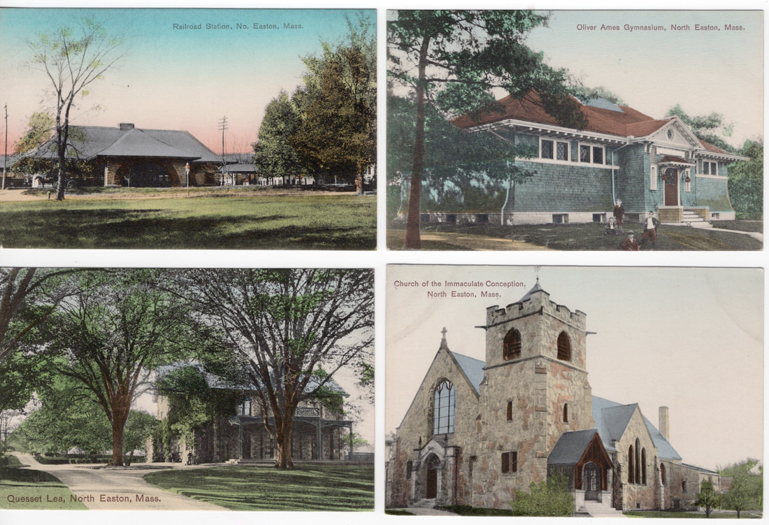
This week I am taking a second look at some of the postcards from A. Frank Pratt, whom I wrote about two weeks ago. The four cards featured today are full color prints that date to the 1910's. To make these postcards, a photographer would take the photo of the desired building or landscape. Since these photos were taken with black and white film, the photographer would make notes about what colors to use for color printing, and send those notes along with the image to a printer for proofing. Black and white film was favored by photographers (think Ansel Adams) because the fine grain size of the film captured every detail in the subject matter, and allowed for excellent printing and enlargements without losing sharpness or other quality problems. If you look at the early color postcards, many of them were printed in Germany, which had perfected the color printing process. Since one could not be in Germany easily to see what the finished product was like, the notes provided by the photographers were vitally important to producing the correct image. I chose these cards today for two reasons: the subjects are familiar and interesting, and the colors have stayed vibrant after more than one hundred years. All four cards were published by O’Connor’s News Store and printed in Germany. The photographer and/or artist is unknown to us. First up is a postcard of our Museum, the former Old Colony Railroad Station. The photo was taken from across the street near the shore of Shovel Shop Pond. An old streetlight and several telegraph poles are seen in the photo, as well as a horse drawn wagon hiding behind the tree on the left. Just to the right of center is the magnificent sycamore tree that now is an Easton landmark. In this photo it is about one hundred years or so younger! I believe it is one of the original plantings on the site, which was landscaped by Frederick Law Olmsted. Note the colorful hues in the sky, undoubtedly asked for by the photographer to make the photo more colorful, and more interesting. Another Easton landmark is featured in the Oliver Ames Gymnasium card. Located on Barrows Street, and today housing the Recreation Department and the Council on Aging, the building served as the original gymnasium for the 1895 Oliver Ames High School. Built with funding from Anna C. Ames, the widow of former Governor Oliver Ames, the building also provided rooms for music instruction in the early days of the Anna C. Ames Band. The green paint is faithfully shown here, as well as four neighborhood boys who probably frequented the building. Next up is “Queset Lea” as it was sometimes called, which stands behind the Ames Free Library. At the time of this photo, it was the home of Broadway producer Winthrop Ames. The photo shows the original landscaping. The drive, which now ends at a walled garden adjacent to the house, once continued to the stables at the rear of the property, and the home of Hobart Ames, which stood to the northwest of this house. It is a rare photo of an early Ames mansion (built for Oakes Angier Ames in 1854) featuring the original approach and plantings. Last, we come to one of the newer buildings at the time, the Immaculate Conception Church on Main Street. Completed in 1904, the stone structure was probably about ten years old in this photo. Excellent detail is present in the photo including the intricate woodwork around the entryways. I must draw your attention to the roof colors in these postcards. The church has had a red roof as far back as I can remember, but this card has the church with a blue roof. Here we see the photographer perhaps taking some “artistic liberty” with his creation. In other postcards of Easton buildings, the roofs and other details in a photo are sometimes given a different color, for no other reason that the artist thinks one color was a better look than another. It is also possible that if no color for the roof was noted, the printer may have assumed slate was used as a roofing material, thereby causing blue to be used in the printing. I do not know if the printer from Germany would have sent a proof back to the publisher; I tend to think not, so there might not have been any corrections made unless the cards were re-ordered for additional printings. Until next week, stay well, Frank
0 Comments
Your comment will be posted after it is approved.
Leave a Reply. |
Author
Anne Wooster Drury Archives
June 2024
Categories |
Easton Historical Society and Museum
PO Box 3
80 Mechanic Street
North Easton, MA 02356
Tel: 508-238-7774
[email protected]

